
Blue Heron Van Co
Project Overview
Project Type:
Brand Identity
Responsibilities:
Iconography, Illustration
Team:
Apricot Creative Studio

The Brief
Tyler, the brains and brawn behind the operation, already liked the more vintage aesthetic that we often worked with and he had a clear idea of where he wanted to go visually when he showed us his initial mood boards. Among the key points of emphasis were to communicate the sense of a high quality product while keeping with a relaxed and approachable visual language. Besides the obvious ask for a blue heron in the logo mark, he also wanted to see some secondary iconography of classic road trip motifs, the outdoors, mountains and trees, camper vans, camp fires and of course his trusty pet dog.

The Process
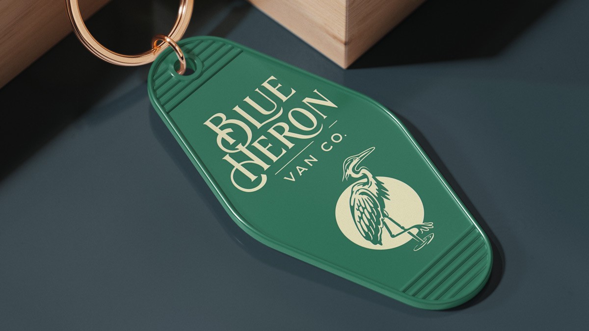
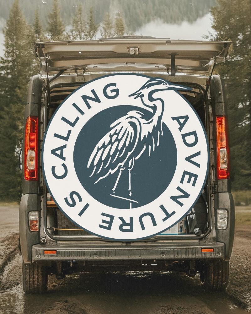
Since we knew that the heron mark was critical, I started working through sketching some different poses and style treatments while the lead designer headed up type exploration. We landed on several poses quickly and after some back and forth on the styling of the line work, the direction of the core elements was set. One last addition to the mark was the circular frame meant to give the feeling of chasing the setting sun down the highway, forever westward.

The Result
As the blue heron is a migratory bird we felt that it was the perfect North Star visual for a life filled with wanderlust and sleeping in a new landscape more often than not. The ever so slight rough edges and ink bleed effects further turned it to a symbol of a lifestyle that champions getting back to basics, embracing a little bit of dirt, and pushing forward down the road.


Logo Color
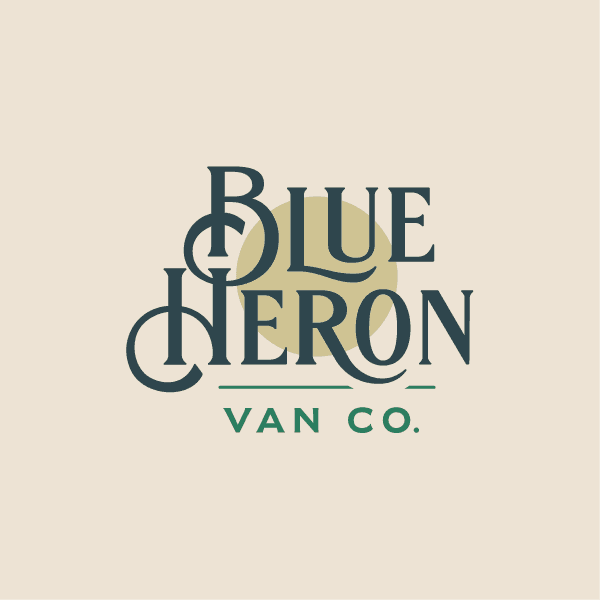
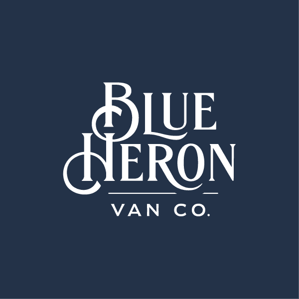
The logo may be used in various configurations depending on the background. Using the elements in the design to determine the color of the logo for maximum contrast and clarity.


