
Alpine Print
Project Overview
Project Type:
Brand Identity
Responsibilities:
Creative Direction Concept, Visual Development, Illustration
Team:
Apricot Creative Studio

The Brief
The challenge presented to us was for the brand to remain fun and engaging for smaller, local clients yet also professional and clean to win the business of larger, more corporate clients. Beyond that we were told the classic screen printing squeegee was (thankfully) a no-fly zone and then it was off to the races.
The Process
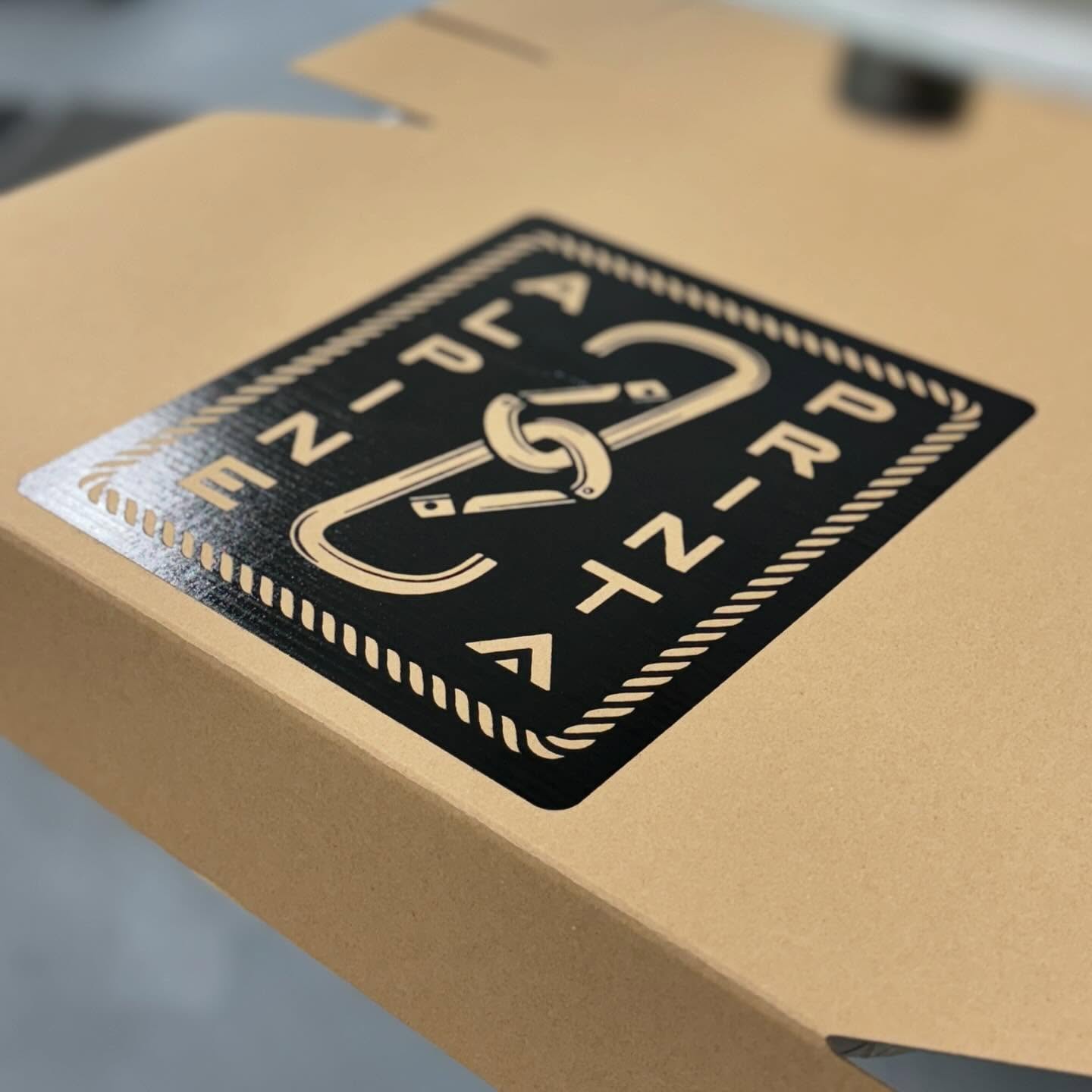
Our inspiration came from one of their shop mantras: "The Smallest Shop, the Highest Quality" in reference the the alpine area occupying the smallest, highest portion of a mountain. From there, the concept of using mountaineering equipment as the iconography was born.
I was responsible for the illustrative elements so I began to develop some options for the main and secondary logo marks. The ice axe quickly became the favorite and led to the custom crossbar of the "A" in the wordmark referencing the axe handle.


The Result
Putting it all together, the final overall look is reminiscent of the early versions of outdoor brands like Patagonia with a no nonsense, detail oriented visual feel. From the initial goal of speaking to both small and large clients, we achieved this in two ways. First, the strong set of iconography and type is leveraged into a swath of merchandise that is packaged together and provided to potential clients in a swag box. Second, the larger clients are addressed by the robust responsive branding and style guide that ensures the front face of the business always looks professional.


