Creative Landscape Depot
Project Overview
Project Type:
Brand Identity
Responsibilities:
Creative Direction Concept, Visual Development, Typography
Team:
Apricot Creative Studio
The Brief
The original branding at CLD was shoehorning the business by looking like a typical lawn care landscaping service with it's use of bright greens and leaf motifs. This direction neglected two-thirds of the business which was in reality much more focused on providing premium landscaping stone. With that in mind, the direction was to keep the brand beautifully minimal and modern, while also creating a visual language that would serve to define the multiple branches of the business.

The Process
I came to this project as the third designer to take a pass at the brand identity for this project. The other designers attempts ended up falling short of the mark for the CLD team so it was my chance to step in and deliver.
In contrast to the organic shapes and irregularities of the materials used in landscaping, I thought instead about the straight edges and symmetrical designs of the tools used to turn those materials into stunning displays of nature. In this case CLD would represent the tool that facilitates their client's needs along the way to that goal.
From that spark I worked on playing with shapes that were clean and minimal and could in turn fit together like puzzle pieces in a myriad of different configurations.


The Result
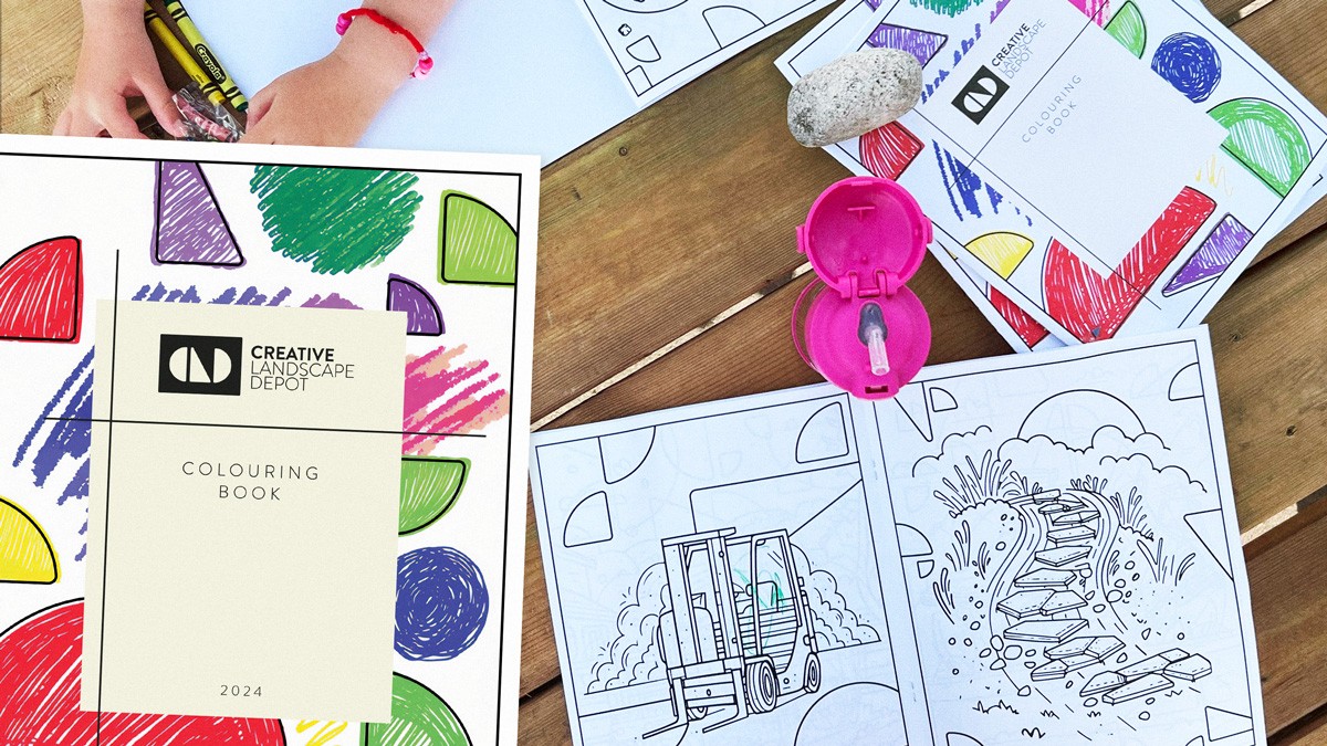
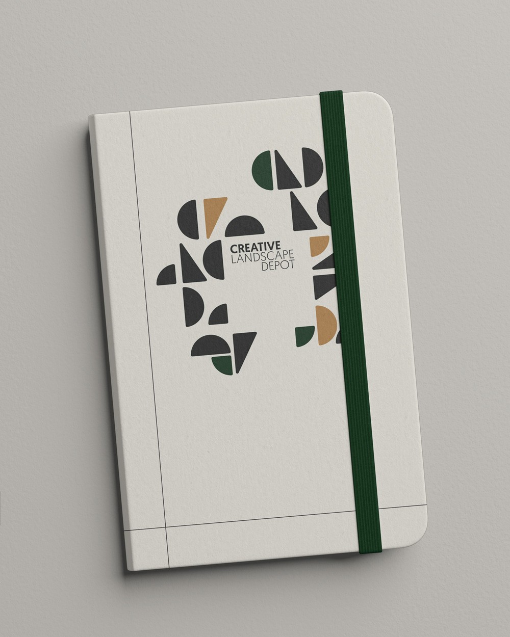
In those shape explorations I worked on creating a series of icons that could be used to form a monogram of CLD while still being versatile enough to be abstracted into symbols for the various elements of the business and as a decorative pattern element. I also knew that a geometric sans-serif was going to be the answer for typography and the slightly rounded edges of Brandon Grotesque fit the bill perfectly.
To finish the full identity I found that leaning into natural material textures paired with more realistic earth tones for the color palette truly helped to prop up the minimal logomark and typography.