Garden at the line
Project Overview
Project Type:
Brand Identity
Responsibilities:
Visual Development, Iconography, Illustration
Team:
Apricot Creative Studio

The Brief
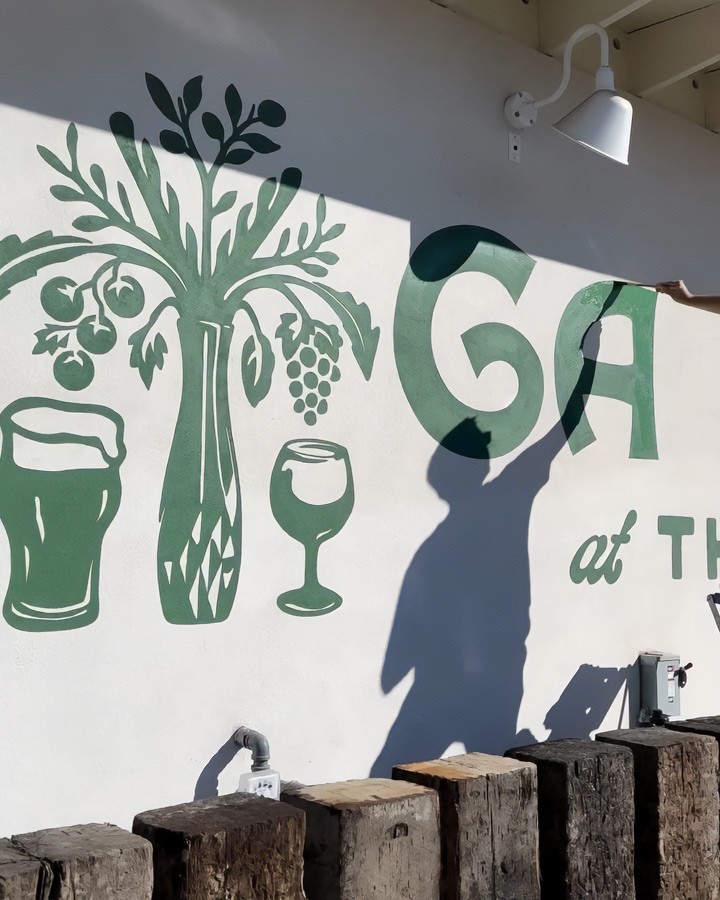
As this was an expansion of a ghost kitchen service into a garden style food hall, our first question to clarify was if the original kitchen's logo was to be incorporated at all or if it was a blank slate. With the news that it was to be a standalone brand we continued to dig for the key points. It was to be clean yet natural and with a hand made touch, simple and modern but with a hint of ancient and aged to whisk the customer away to a Mediterranean culinary oasis.

The Process
In our initial internal brainstorming session we toyed with the idea of distilling down the imagery of an oasis into a compact recognizable form, but it felt lacking and overly generic. Instead, I focused more on the bounty of a garden and classical Mediterranean motifs including an olive branch and a vase filled with various culinary plants. Later in the process the client asked us to revisit the oasis concept as a secondary lockup, so I built out a scene of the olive tree (connecting it back to the main iconography) surrounded by the rivers and mountains of the local Sacramento area.

The Result
The final brand package was further applied to a multitude of merchandise items, menus, social media graphics, drinkware, and a series of hand painted murals.